Convert Documents to Dashboards

Document processing has evolved far beyond simple text extraction. Today's businesses need to transform the wealth of information locked in their documents into meaningful, actionable insights. At Docflo.ai, we've built a comprehensive analytics platform that seamlessly converts extracted document data into powerful visualizations that drive decision-making.
The Journey from Raw Documents to Rich Analytics
Every document contains valuable data points waiting to be unlocked. Whether it's invoices, contracts, financial statements, or operational reports, the path from document to dashboard involves several sophisticated steps:
1. Intelligent Data Extraction
Our AI-powered extraction engine doesn't just read documents - it understands them. By identifying key data points, relationships, and context, we create structured datasets from unstructured documents. This process transforms:
- Invoices → Revenue trends, vendor analysis, payment patterns
- Contracts → Term analysis, compliance metrics, risk indicators
- Financial Reports → Performance indicators, trend analysis, comparative metrics
- Operational Documents → Process efficiency, resource utilization, quality metrics
2. Data Normalization and Enrichment
Raw extracted data needs refinement to become analytically useful. Our platform automatically:
- Standardizes formats across different document types and sources
- Validates data integrity to ensure accuracy in downstream analysis
- Enriches datasets with computed fields, calculations, and derived metrics
- Resolves inconsistencies in naming conventions, currencies, and units
3. Real-time Analytics Processing
Once normalized, data flows into our analytics engine where it's processed for visualization. This includes:
- Aggregation of data across time periods, categories, and dimensions
- Trend calculation to identify patterns and anomalies
- Statistical analysis for variance detection and forecasting
- Correlation analysis to uncover hidden relationships
Comprehensive Visualization Options
Our platform offers a full spectrum of visualization types, each optimized for different data stories and analytical needs:
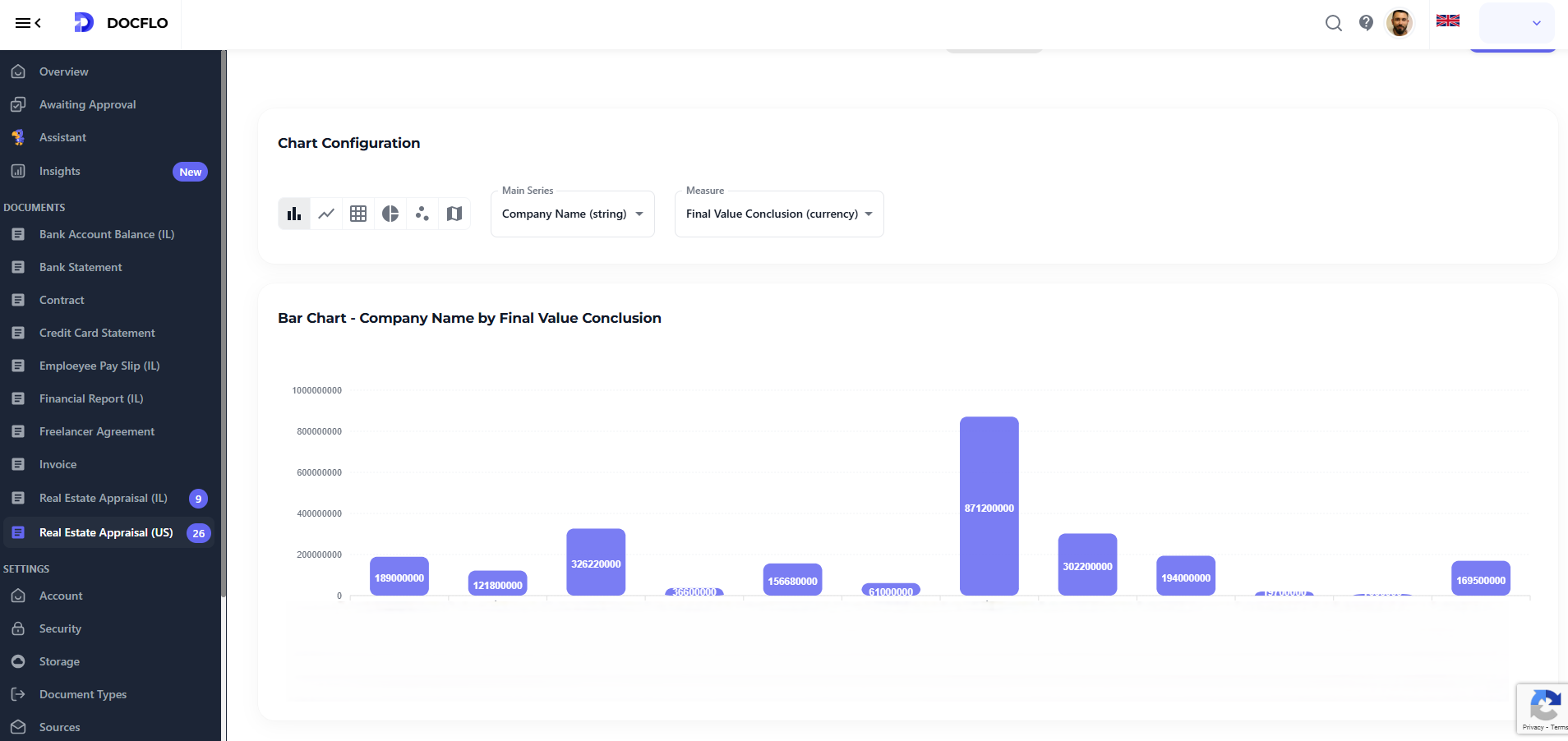
Bar Charts
Perfect for comparing discrete categories and showing rankings:
- Revenue by product category from sales documents
- Vendor performance comparison from procurement data
- Department expenditure analysis from financial reports
- Compliance scores across different business units
Line Charts
Ideal for temporal analysis and trend visualization:
- Monthly revenue progression tracked from invoice data
- Processing time improvements over operational periods
- Quality metrics evolution from inspection reports
- Cost reduction trends from expense documentation
Pie Charts
Excellent for showing composition and proportional relationships:
- Budget allocation breakdown from financial documents
- Market share distribution from sales reports
- Resource utilization patterns from operational data
- Document type distribution in processing workflows
Scatter Plots
Powerful for correlation analysis and relationship discovery:
- Cost vs. quality relationships from vendor assessments
- Processing time vs. document complexity analysis
- Performance vs. investment correlation from business reports
- Risk vs. return analysis from financial documents
Heatmaps
Superior for pattern recognition across multiple dimensions:
- Seasonal demand patterns from order documents
- Geographic performance distribution from sales data
- Time-based activity intensity from operational logs
- Correlation matrices between different business metrics
Putting your data on a map
One of our most powerful features is the automatic conversion of text descriptions to precise geolocations. This happens seamlessly in the background:
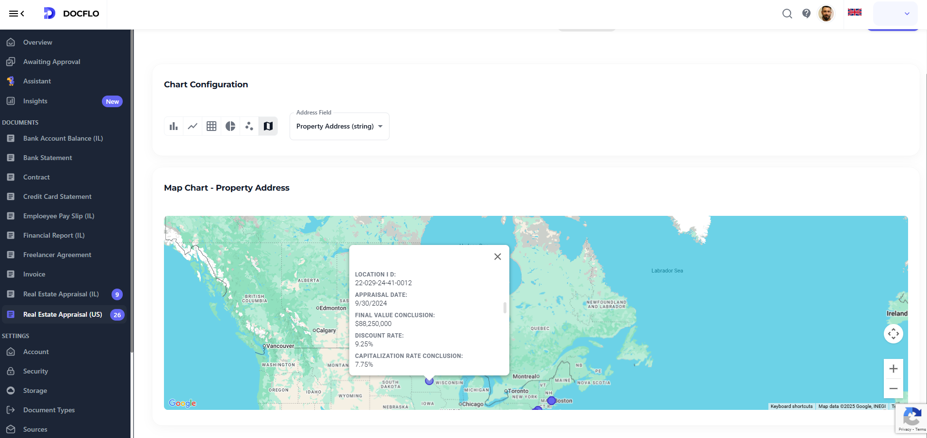
Address Intelligence
When documents contain location information, our system:
- Extracts address components from various formats and languages
- Validates addresses against global geocoding databases
- Resolves ambiguities using contextual clues from the document
- Geocodes locations to precise latitude/longitude coordinates
Smart Location Recognition
Our AI recognizes location references in multiple formats:
- Full addresses: "123 Main Street, New York, NY 10001"
- Partial addresses: "Downtown Seattle office"
- Landmark references: "Near Central Station, London"
- Regional descriptions: "Northern California operations"
Map Visualization Types
Density Maps
Show concentration of activities across geographic regions:
- Sales density from customer invoices and contracts
- Supplier distribution from procurement documents
- Service area coverage from operational reports
Route Optimization Maps
Visualize logistics and supply chain efficiency:
- Delivery route analysis from shipping documents
- Supply chain visualization from vendor contracts
- Service territory mapping from customer agreements
Performance Heat Maps
Geographic performance analysis at various scales:
- Regional sales performance color-coded by revenue
- Service quality distribution across different locations
- Cost efficiency mapping by geographic region
Choropleth Maps
Statistical representation across administrative boundaries:
- State/province level analysis of business metrics
- Country comparison for international operations
- Market penetration visualization by administrative region
Real-World Analytics Applications
Financial Analytics Dashboard
Transform financial documents into comprehensive dashboards showing:
- Cash flow trends from bank statements and invoices
- Expense category breakdowns from receipts and bills
- Vendor payment analysis with geographic distribution
- Budget vs. actual performance with variance analysis
Supply Chain Intelligence
Convert procurement documents into supply chain insights:
- Supplier performance scorecards with quality metrics
- Geographic supplier diversity visualization
- Cost trend analysis across different product categories
- Lead time optimization opportunities identification
Customer Analytics Platform
Transform customer documents into relationship insights:
- Customer lifetime value progression over time
- Geographic customer distribution with growth patterns
- Service utilization heatmaps across different regions
- Customer satisfaction trends from feedback documents
Operational Excellence Dashboards
Convert operational documents into efficiency metrics:
- Process performance indicators with trend analysis
- Resource utilization patterns across different locations
- Quality metrics distribution with geographic correlation
- Compliance tracking with automated alerting
Advanced Analytics Features
Interactive Filtering and Drilling
Every visualization supports dynamic exploration:
- Time range filtering to focus on specific periods
- Category filtering to isolate particular data segments
- Geographic filtering to analyze specific regions
- Cross-chart filtering for comprehensive analysis
Export and Sharing
Analytics insights need to reach decision-makers:
- Dashboard sharing with customizable access controls
- Automated report generation with scheduled delivery
- Data export in multiple formats (PDF, Excel, CSV)
- Embedding capabilities for integration with other systems